What the football poster trend looks like
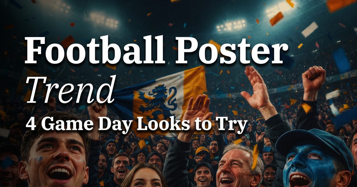
The football poster trend turns one portrait into a stadium-ready fan graphic that feels built for a big match night. It mixes bold type, floodlights, confetti, jersey colors, and a hero pose. The result looks halfway between a sports flyer and a glossy social post.
The best versions stay simple at a glance. One face. One strong color palette. One headline. That is why the trend works so well in feeds and stories. It reads fast, but still feels premium.
For a clean layout, the poster design basics still matter. Krea’s guide on how to design a poster with AI in 2026 breaks poster making into two paths: generate the art or build a clean layout around it. The football poster trend sits right in the middle.
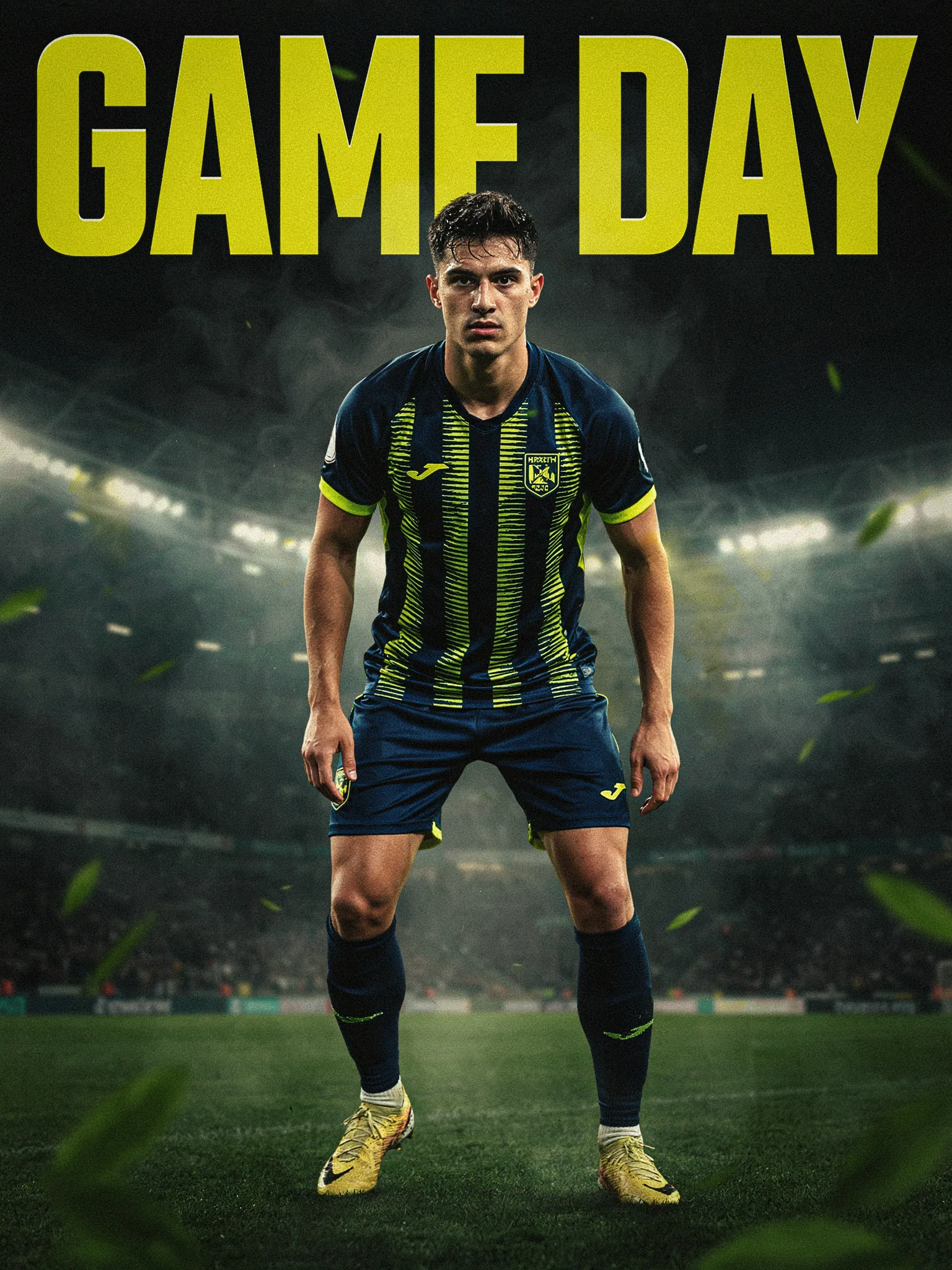
4 football poster trend looks to try
Each version below hits the same trend from a different angle. One leans polished and editorial. One goes full supporter mode. One feels gritty and street. One pushes the composition harder for a louder feed post.
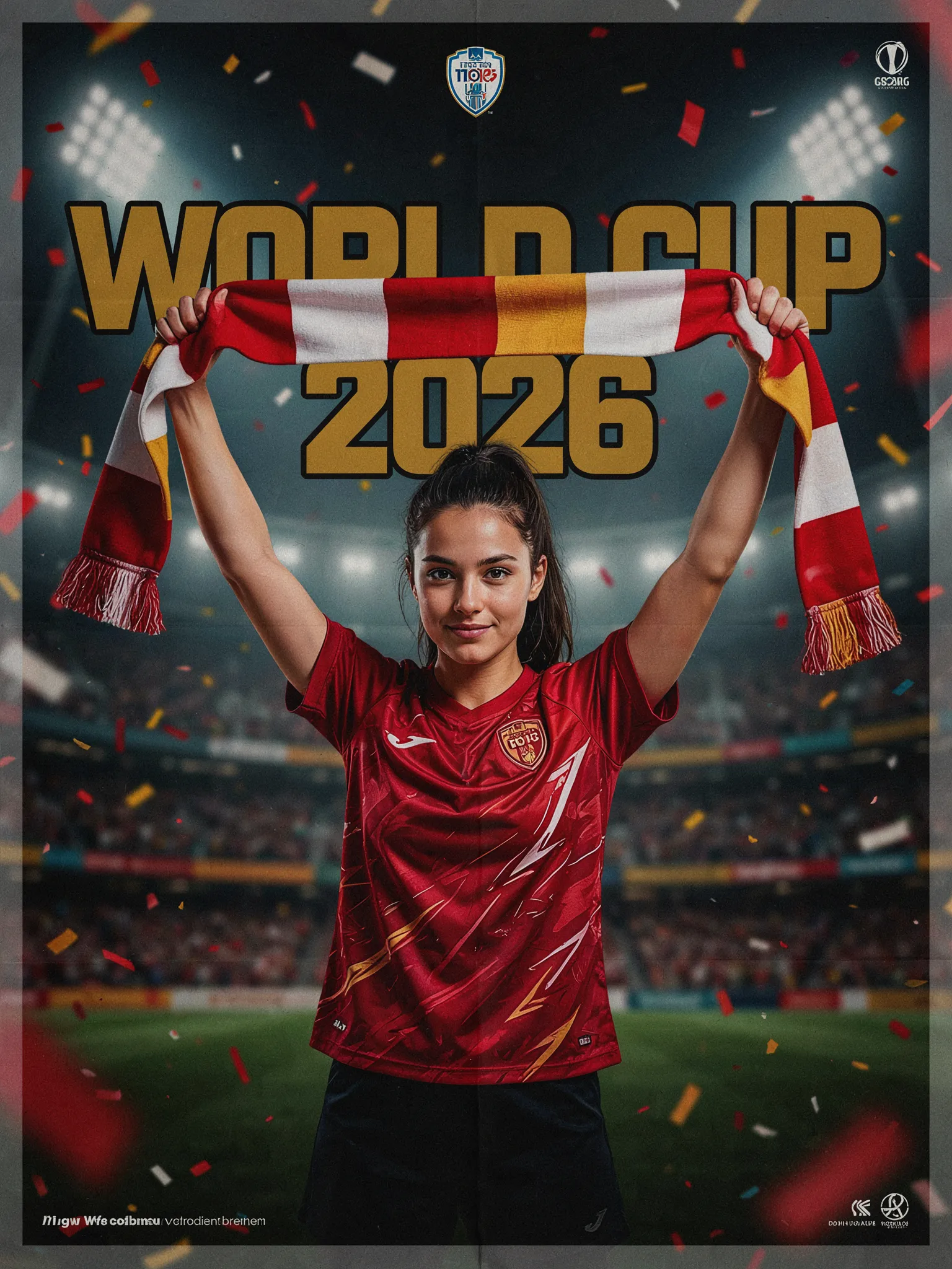
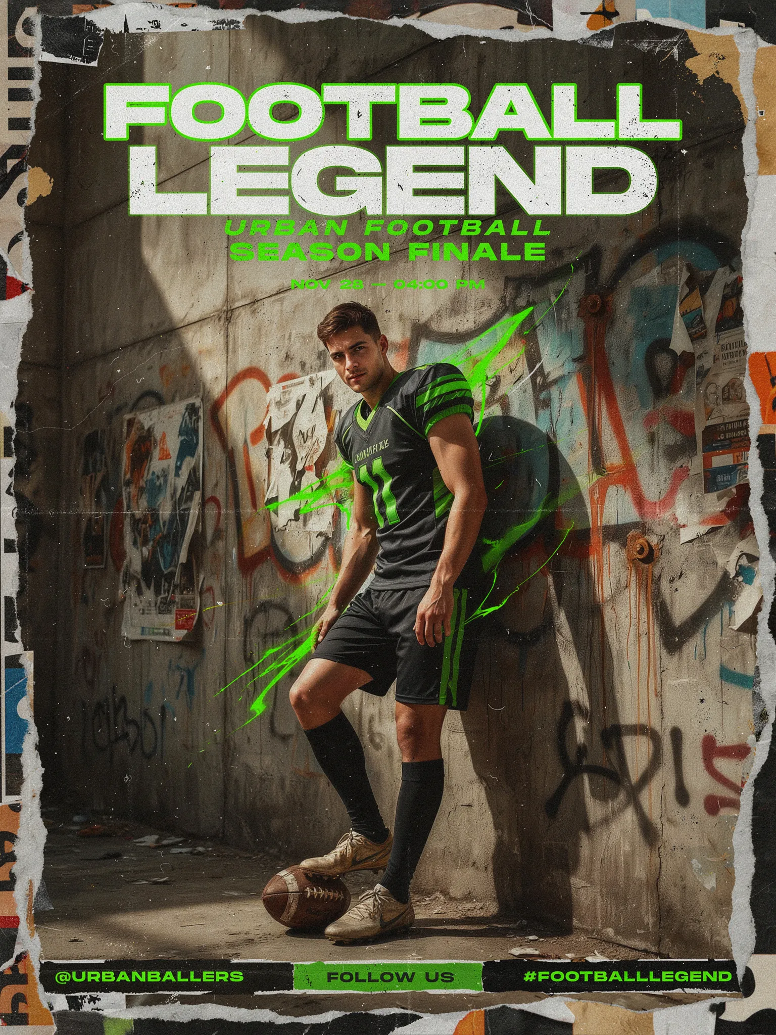
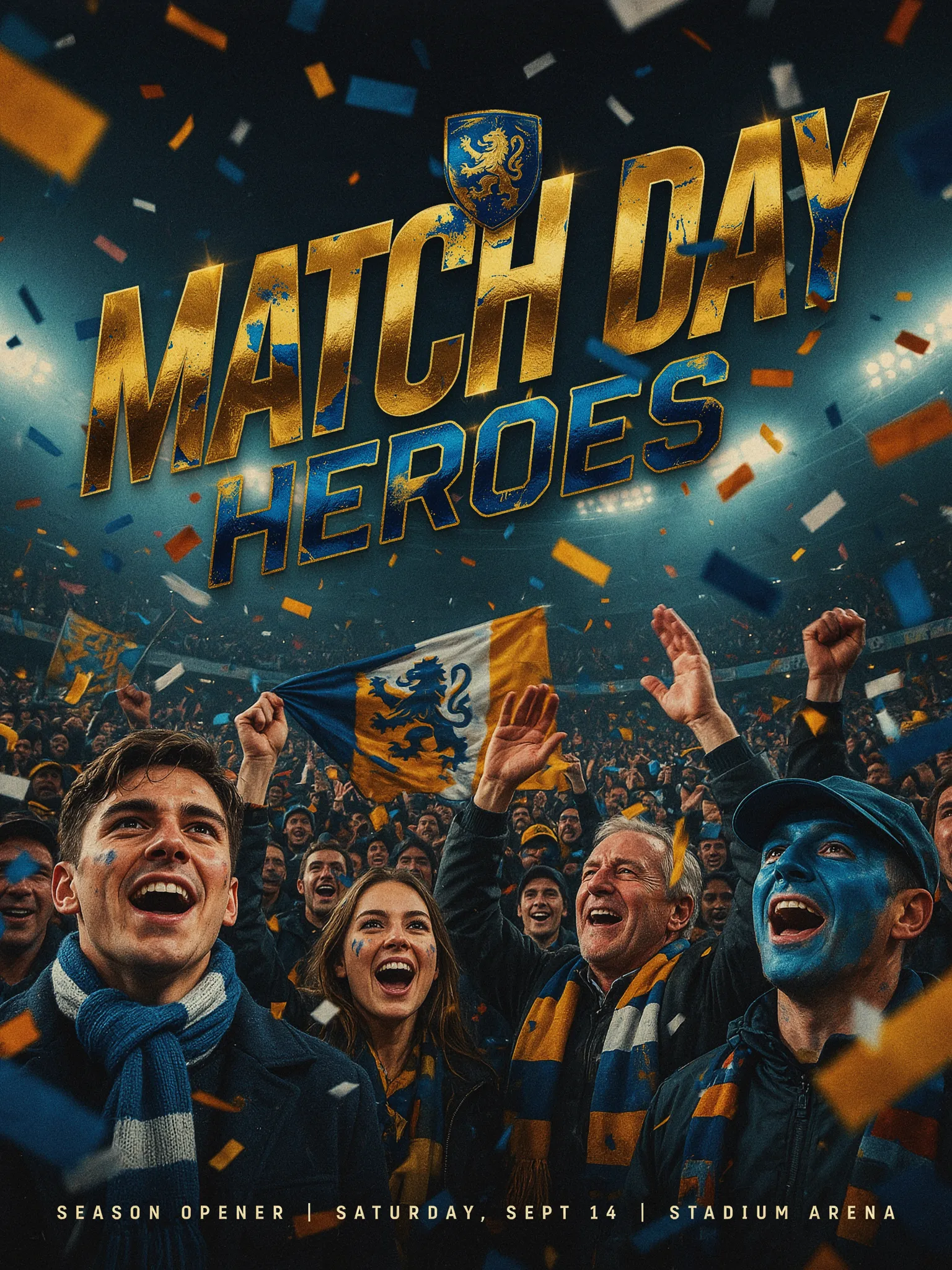
| Look | Vibe | Prompt cue | Best use |
|---|---|---|---|
| Game Day | Clean and cinematic | floodlights, smoke, centered hero | Profile post |
| World Cup 2026 | Loud supporter energy | bold gold type, scarf, flags | Story or reel cover |
| Football Legend | Gritty and street | torn paper, concrete, neon accents | Feed post |
| Match Day Heroes | Busy and high energy | crowd layers, confetti, foil texture | Campaign graphic |
Prompt cues that make the football poster trend work
Short prompts usually win here. The model has less room to wander, and the layout stays sharper. Name the subject, the jersey color, the light source, and the headline. That gives the image a clear job.
Use one strong color pair per image. Red and gold. Navy and yellow. Green and black. The poster feels more designed when the palette stays tight. If the art gets noisy, cut one element instead of adding another.
Portrait framing helps too. The trend lands better when the face and title sit high in the frame. That leaves room for the body, the scarf, or the crowd without burying the headline. For a similar bold-light look, the flash portrait look is a good companion style.
Social posts and posters also need a clear read on mobile. Big type. Strong contrast. One focal point. That is the whole trick.
When the edit misses, fix this
If the poster feels flat, raise the contrast first. Then sharpen the subject description. Then remove one background detail. The fastest cleanup is often subtraction, not more prompting.
If the typography looks weak, ask for a single headline instead of two lines of copy. If the crowd overwhelms the face, move the subject to center and make the background softer. If the image feels too generic, add one local detail like a team scarf, a stadium tunnel, or a flag color.
The sweet spot is simple: one portrait, one poster idea, one moment. That is what keeps the football poster trend easy to recreate and easy to share.
These four looks are built for quick posts, fan pages, and match-day edits. Pick one style, keep the palette tight, and let the poster do the talking.
Create this effect in Bloom AI
Recreate these effects on your own photos and videos — free to start.